Art
In 1986, I stumbled upon a book called Posters: A Concise History by John Barnicoat and it changed everything. I spent years analysing every page. Originally published in 1972, it charts the evolution of poster design from the 1800s to the early ’70s (and may have been revised since). It’s packed with full-colour reproductions: 1960s psychedelia, Bauhaus compositions, war propaganda, and more.
To some, poster art falls under the umbrella of Graphic Design, but everything in that book predates desktop publishing. These are handmade, analogue visions, ink, paper, sweat, and obsession.
Artists
These days, I don’t follow many artists, but as a teenager, I absorbed it all. The first time I saw a Salvador Dalí painting, my brain split open, I didn’t know painting could look like that. From there I found René Magritte, then H.R. Giger.
Giger’s work on album covers led me down another path: Abdul Mati Klarwein, who painted mind-bending covers for Miles Davis (Bitches Brew, Live-Evil, On the Corner). It made me realise album sleeves could be gallery-worthy art in their own right, especially in the ‘70s prog rock scene, where excess met imagination.
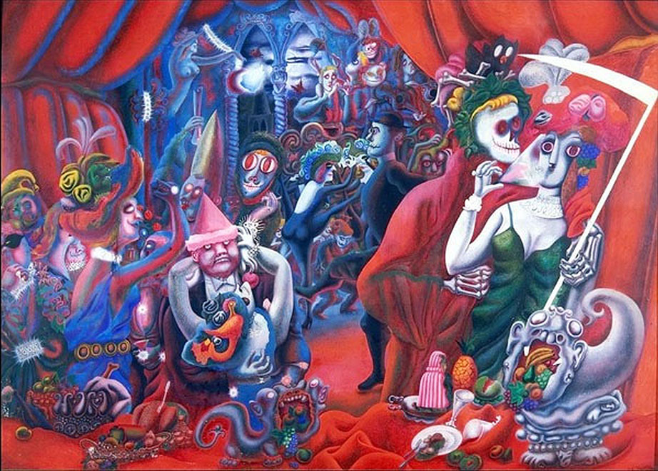
Another early obsession was Edward Burra. I found a postcard of John Deth (Hommage to Conrad Aiken) and was immediately hooked. His work is grotesque, surreal, and utterly unique, still massively underrated.
Although my own work looks nothing like Giger’s, his dark intensity was a huge influence. It gave me permission to be weird.
Graphic Design
There’s a lot of symmetry in what I do. I often start by drawing a line down the centre of the page, working one side first, then mirroring it to the other. My school art teacher told me never to use a ruler, I’ve been rebelling against that ever since.
Maybe it’s my love of posters. Maybe it’s graphic design. But symmetry and structure are baked in. Influences include:
- The Bauhaus movement
- Psychedelic 60s poster art
- Milton Glaser
- Hipgnosis
- Central Station Design
- Paul Rand
- Saul Bass
- Rocket Recordings — one of my favourite current labels, who still design all their album covers in-house